PROBLEM
The transition of silly season content from a dedicated blog to the standard newspaper flow resulted in a significant decrease in article views and CTR. This change disrupted the user experience, making it harder for readers to access and engage with this specific content. To address this issue, a solution was needed to enable viewers to consume more silly season content quickly and easily, improving accessibility and boosting engagement.

ROLE
Project manager/UX/UI-designer /workshop facilitator.
ACTIVITIES
Persona, Wireframes, Design Studio, User testing, Sketch and Invision prototyping, Zeplin handoff, Data driven insights.
DISCOVERY
I conducted a competitor analysis and did a Google Analytics review. I also did a current content audit and surveys to get to know the users and market.
DEFINE
User data that was available through other projects was analysed. Additionally a persona was created based on the research done in the first phase.
DEVELOP
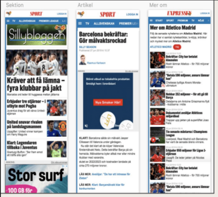
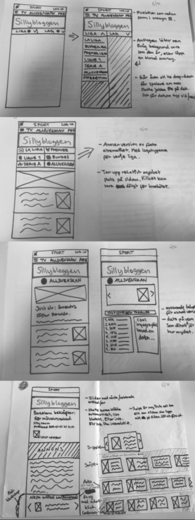
I facilitated a Design Studio workshop with stakeholders to gain knowledge about their expectations and ideas. The workshop amounted into a pile of sketches, some of which are displayed here.
ITERATION
I conducted user and stakeholder tests. 7 iterations were made based on feedback from developers, sport news managers, analytics, my team and users. Most iterations were revised in sketch format. Some ideas were removed due to technical difficulties, time-constraints and others, based on data and feedback from users.
DESIGN
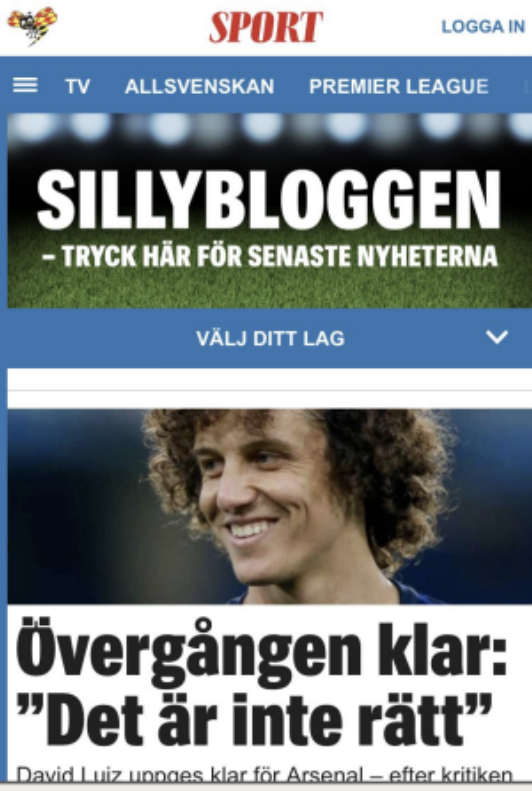
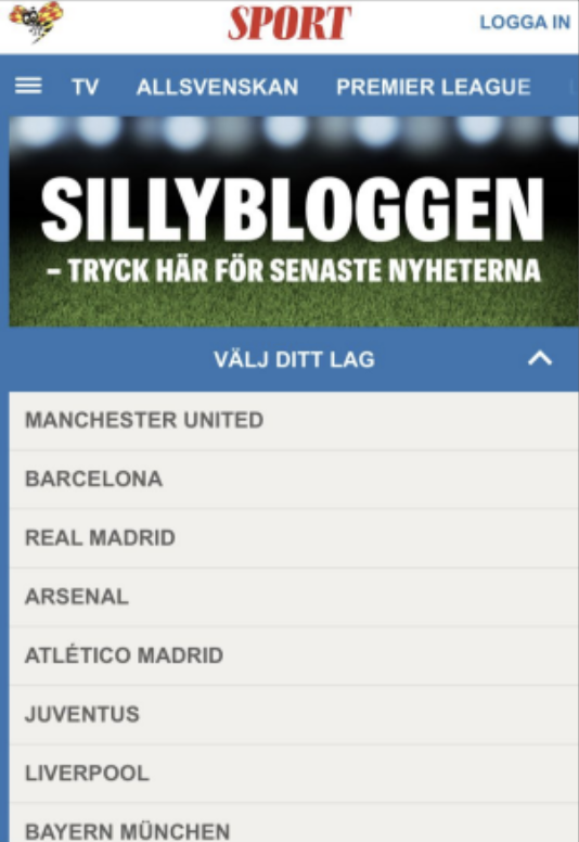
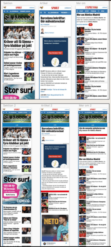
The top picture illustrates what the original overall design looked like. Second picture is with the menu added onto that design. These only illustrate the responsive mobile version, however desktop and other devices was also taken into consideration.
DELIVERY
The final Sketch prototype was communicated with the rest of the team. My prototype was then, together with developers in my team, implemented as a widget under the first page, football section and silly season section. The widget, containing the menu, links to new team-specific pages so that the user can get more information about their desired team. The menu widget is visible here on the left in its final state. During the first two days, 63% of the users that opened the widget, clicked through to another section and continued reading!