PROBLEM
After launching the site it became clear that we didn’t know how we should organize and structure the website’s navigation and content in a way that reflects users’ expectations and mental models. So in order to improve usability and overall user experience I started to investigate this.

ROLE
Co-founder/E-commerce manager/Product Designer
ACTIVITES
Observation, Tree Testing, Card Sorting, User Testing, Site Mapping, Lightning Demo.
DISCOVER
In order to gain an understanding of how users categorize information in this industry I started doing observations and informal chats with in-store customers to gather initial insights. This helped identified early topic categories. To take it one step further I did Lightning demo sessions with two people with more knowledge on the topic to generate broader ideas from. These exercises helped developed a set of preliminary categories and cards for testing.
DEFINE
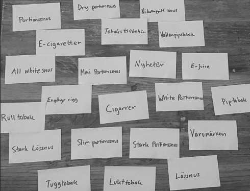
The initial data gathering and brainstorming session resulted in a number of topics. Which were summarised into a spreadsheet and to the actual cards that was to be tested. The cards are shown in the picture. The top picture illustrates the group categorisation for the primary pages, those that were identified as crucial.

DEVELOP
To validate and iterate on the structure to ensure real-world usability the cards created in the previous step was used in hybrid card sorting sessions with 10 users. The users were allowed to modify the groups by adding, deleting or renaming them. Based on
the recurring patterns from the tests, an initial site map was created were primary categories were added, two of which had several
subcategories (snus & tobak). In order to evaluate the hierarchy according to how it would perform in a real-world scenario, a tree testing workshop was conducted. Users were presented with the established navigation from the card sorting session and were provided with a series of tasks. One task example is shown in the picture.
DELIVER
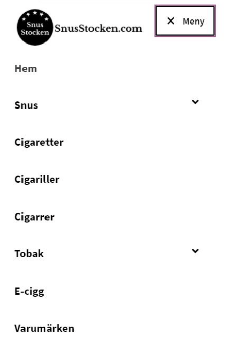
After evaluating the user success rates and first-click accuracy I confirmed that primary categories worked well. The refined architecture was implemented on the live website by integrating final categories into the site’s navigation menu, styled according to the brand guidelines at that time. The new information architecture launched on SnusStocken.com. Mobile menu screenshot shown.